

Where veterinary trust meets a seamless checkout.
Project Overview- MyVetStoreOnline is a white-label eCommerce platform serving pet owners across approximately 2,400 veterinary clinics nationwide, handling the coordination of prescription medications between vet practices and their clients. The platform manages a sensitive, three-party relationship: the pet owner, the prescribing veterinarian, and the fulfillment system, where trust, clarity, and accuracy aren't just nice-to-haves, they're clinical necessities.
Design Problem- Tight scope and budget required high-impact, targeted improvements. A full redesign wasn't on the table. The challenge was identifying the right fixes to drive the biggest gains in usability and trust, in a context where a confusing checkout or an unrecognized brand name could cause a pet owner to abandon a medication their animal actually needed.
Goal- Overhaul the wallet and checkout experience, strengthen clinic branding, and lay the groundwork for broader improvements across a regulated, relationship-driven commerce environment.
Result- A streamlined wallet and checkout that reduced friction at key decision points. Clinic branding elevated throughout, strengthening pet owner trust in their veterinarian rather than an unfamiliar eCommerce name.
Role- Senior UX/UI Designer
Status- Ongoing, with key elements implemented.
Timeline- 90 Days
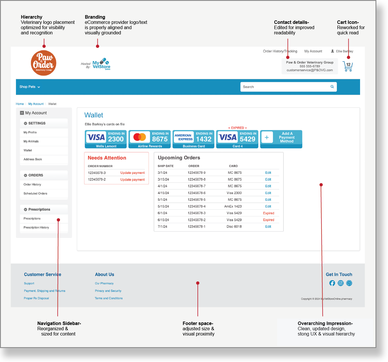
Wallet Update & UX Optimization

Wallet Overhaul
Strategic rebuild within a strict scope to prevent site-wide disruption. Designed to support recurring prescription refills as much as one-time purchases, built around the reality that most users return regularly for their animals' ongoing medications.
Key Wallet Improvements:
Clearer card expiration alerts
Streamlined autoship order management
Simplified credit card handling (add/remove/update)
Custom nicknames for payment & shipping
At this point I advised shifting focus from the MyVetStoreOnline brand to the veterinary clinics, ensuring pet owners connected with their trusted vet rather than an unfamiliar platform name. In a prescription medication context, that trust isn't cosmetic. It's the reason a pet owner completes the purchase.
Checkout Optimization
Reduced checkout from 8 to 3 steps for returning customers, a high-impact improvement given that prescription refill customers represent a significant share of repeat traffic. Payment and shipping management relocated to the wallet, replacing multi-step processes with autofill for saved preferences.
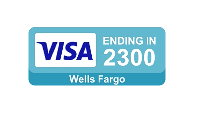
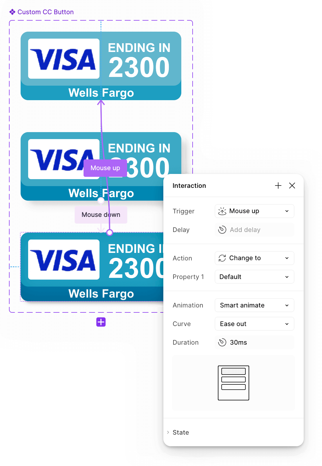
Card Elements & Button Functionality
Clickable credit card components were designed with interactive states for rollovers and clicks, enhancing the Wallet feature’s usability.
Button elevation was identified as a broader UX gap. Subtle depth cues were designed and recommended for future implementation — see the Figma Component set with Variants.
Visual & UX Enhancements
Targeted updates that improved usability and brand trust without a full redesign:
Elevated veterinary practice logos in headers
Streamlined navigation, headers, and footers
Enhanced shopping cart visibility
Eliminated redundant content
Future Vision: My Animals
Proposed wallet expansion to manage per-animal prescription history, refill tracking, payment, and shipping data. Designed for multi-pet households and equine/livestock customers managing multiple medications, complex addresses, and coordinated vet relationships.


Before:

Desktop-First, Mobile-Ready
MyVetStoreOnline operates with a desktop-first mindset, yet mobile purchases continue to grow. The wallet was designed to perform seamlessly across both.
Explore the social media and digital content.