
Get out on the water faster with sleek booking features.

Project Overview- With 25+ years of design experience, I often arrive at solutions intuitively, then use research and testing to pressure-test and refine them. This project documents that process: starting with a clear vision, validating it with users, and iterating where the data suggests refinements.
Design Problem- A paddle rental business relied on calls and walk-ins, creating friction and limiting discoverability.
The Goal- Build an intuitive, mobile-friendly experience with live availability, easy checkout, and a fun, memorable brand. The process spanned research, wireframing, prototyping, user testing, and brand development.
Result- A polished prototype, responsive design system, and “duck.duck.paddle!” identity ready to make booking fast and engaging.
Role- Lead Product & UX Designer
Status- Self-Initiated Project
Timeline- 8 weeks
Research: User Insights
User Interviews- Subjects viewed paddling as a relaxing escape, but frustrations finding rentals led them to choose other activities.

Site Maps & Lo-Fi Wireframes
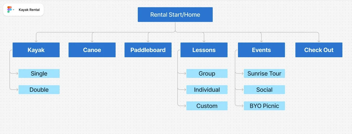
Site Map- Information architecture for frictionless navigation.
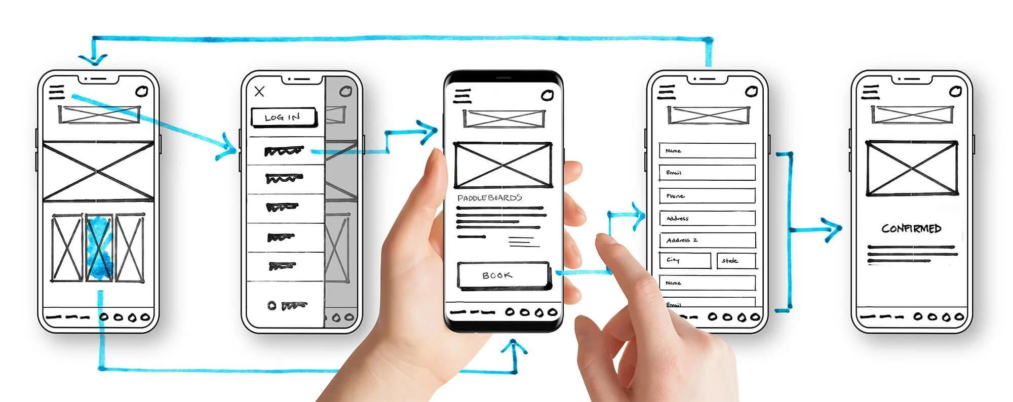
Mobile-first Wireframes- Hand-drawn sketches rapidly explored options for the 85% of users who book on their phones.
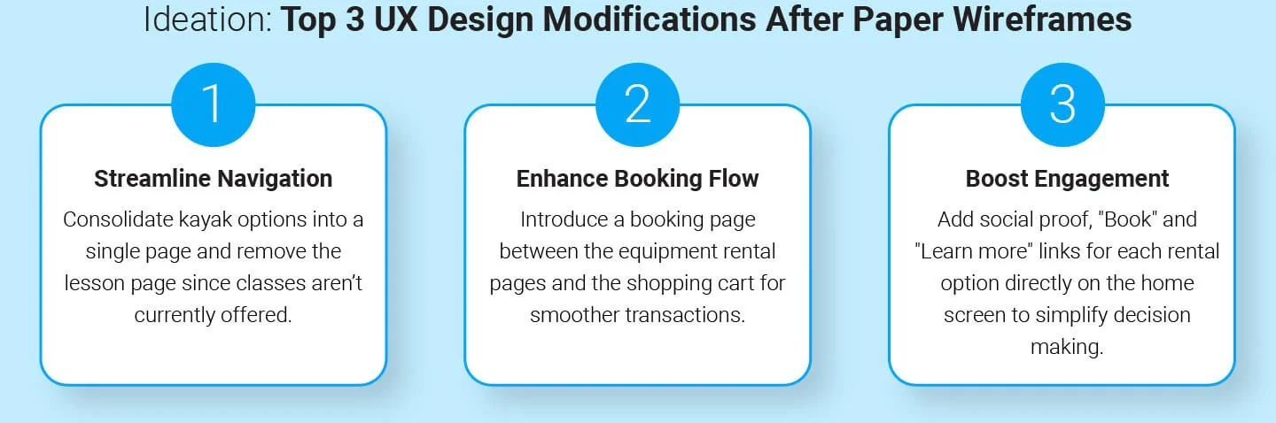
Usability Studies: Prototypes & Branding


Home Screen Shortcut – Mobile testing confirmed returning users would choose to bypass listings, reducing steps and streamlining reservations.
Usability Study- Mobile testing confirmed smooth interactions and highlighted areas to improve.
50% fewer steps to booking

Figma Prototypes and flow mapping– Enabled hands-on testing, gathering actionable stakeholder feedback.
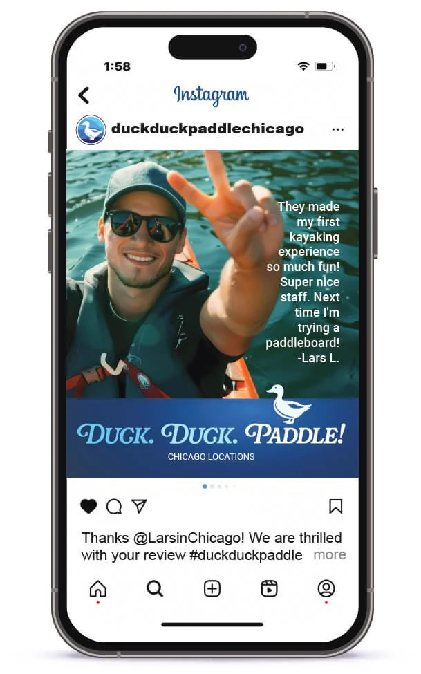
Naming Strategy & Brand Development - A memorable name and strong visual brand was vital to create an instant connection.

Explore the naming process.

Hi-Fi Prototypes & Design Systems
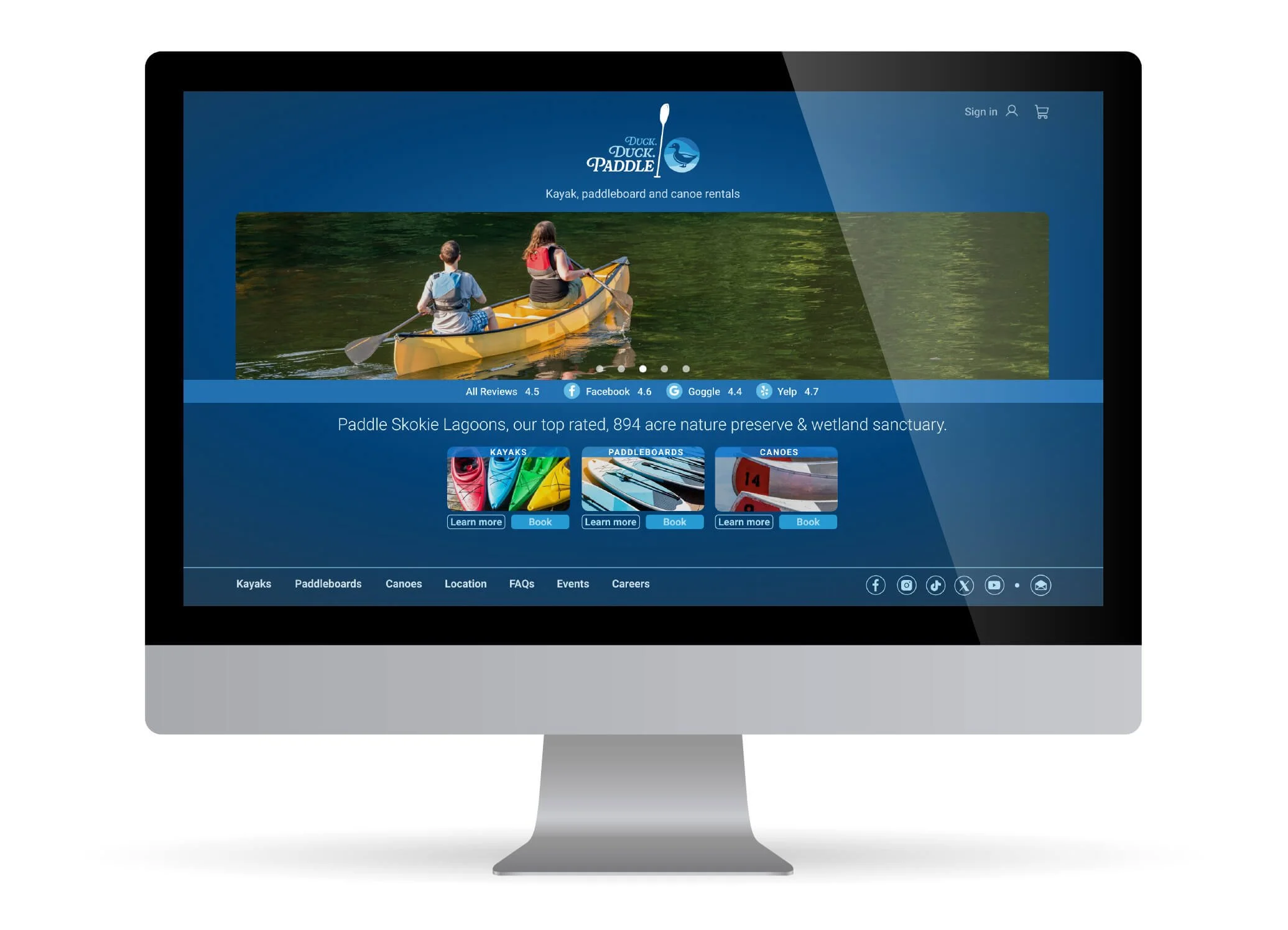
Design System– A cohesive framework with consistent components reinforces the brand.

Accessibility– Accessibility was built into the design system from the start — color contrast verified against WCAG 2.1 AA, with CPACC-informed decisions throughout."

Key screens- highlight design consistency across platforms.


Test drive the mobile Figma prototype.

Light/Dark Mode- Optimized contrast to enhance usability and brand consistency.
Responsive Design- ensures a consistent experience across devices.

The UX design process: research, ideate, prototype, test, iterate… wash and repeat.
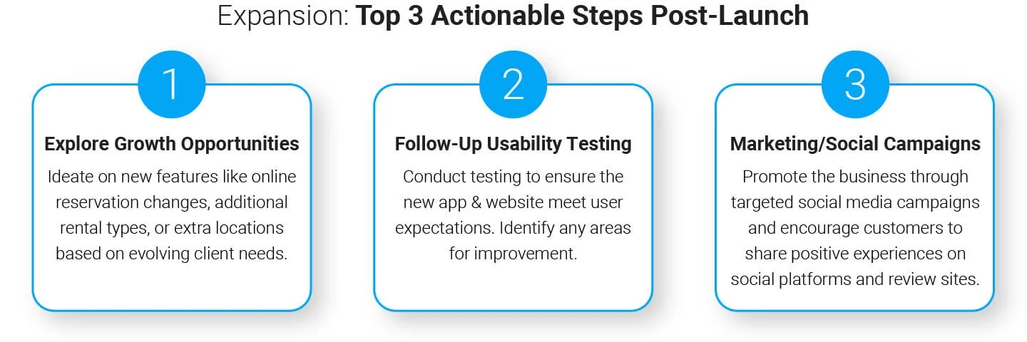
Post Launch: Results & Future Vision