
Project Overview- Developed a full-concept FinTech dashboard for True North Financial’s Clear Spend product.
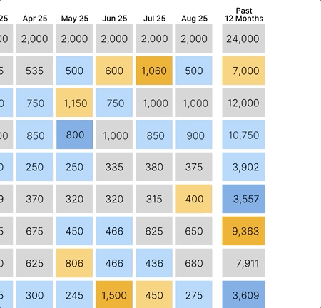
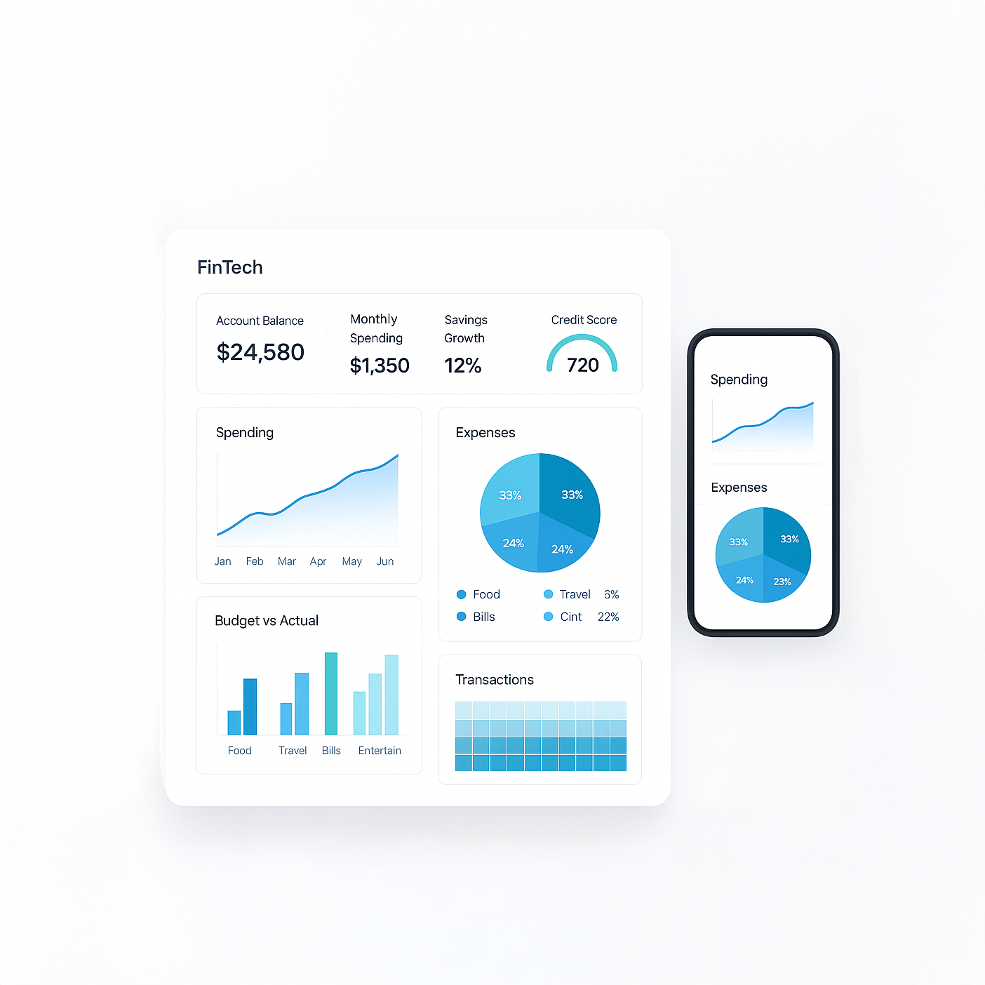
Naming, branding, UX copy, and visual design were created to help users monitor and manage monthly budgets. Charts and visualizations were selected to clearly convey spending, savings, and budget trends at a glance, including pie charts, heat maps, and savings growth lines.
AI tools (Claude, MidJourney) were used for early-stage visual exploration; all final design decisions were human-directed for clarity, usability, and hierarchy.
Key Features-
Personal Greeting: “Good afternoon, Helen. Your budgeting concierge awaits.”
Top Summary Cards: Quick access to savings, last month’s budget, spend vs. difference, and credit rating.
Smart Categorization: Once a bill is classified future spending is automatically sorted. The system learns from user inputs over time.
A full-concept FinTech dashboard: naming, branding, and charts.
Dashboard Visuals: 12-month heat map and monthly pie chart show over- and under-budget spending with color coding and amounts.
Goal- Create a friendly, intuitive, and actionable dashboard that allows users to monitor spending, track savings growth, and manage budgets without feeling overwhelmed. Showcase how UX/UI design, clear microcopy, and visual hierarchy can make financial data approachable and actionable.
Result- Charts and visuals were strategically designed to make financial data approachable and instantly understandable.
Role- UX/UI Designer & Prototyping Lead
Designed to showcase information architecture, data visualization strategy, and microcopy decisions for complex financial data.
Visual Insights, Smarter Decisions
Interactive data visualizations and color-coded dashboards turn complex financial information into clear, actionable insights. Users can quickly understand spending patterns, track savings, and make confident budgeting decisions at a glance.
Click-Activated Tooltips
This interactive feature gives users detailed budget clarity right at their fingertips.

User Focused
Highlights the user’s toughest spending category front and center each month.
AI-Assisted Exploration
ChatGPT and MidJourney suggested layouts and visuals; final interfaces were human-developed and refined for clarity and usability.